Introduction
Weather conditions have a profound effect on economies, especially in countries reliant on agriculture. But can these conditions also influence currency markets? In this article, we dive into how weather data can be collected, analyzed, and used to inform currency trading strategies with Python. Inspired by concepts from this MQL5 article, we’ll explore the process step-by-step, empowering you to build a trading system that leverages weather insights for potential forex market advantages.
1. Data Collection: Gathering Weather and Currency Data
To analyze weather’s impact on currencies, we first need robust datasets:
- Weather Data: Historical weather data for agriculture-heavy regions (e.g., Australia) can be sourced from APIs like OpenWeatherMap or NOAA. Key metrics include temperature, precipitation, and humidity.
- Currency Data: Exchange rate data for relevant currencies (e.g., AUD/USD) can be fetched from financial APIs such as Alpha Vantage or OANDA.
Using Python, libraries like requests for API calls and pandas for data handling streamline this process.
Here’s a snippet to fetch weather data:
def fetch_agriculture_weather():
    """
    Fetching weather data for important agricultural regions
    """
    key_regions = {
        "AU_WheatBelt": {
            "lat": -31.95,
            "lon": 116.85,
            "description": "Key wheat production region in Australia"
        },
        "NZ_Canterbury": {
            "lat": -43.53,
            "lon": 172.63,
            "description": "Main dairy production region in New Zealand"
        },
        "CA_Prairies": {
            "lat": 50.45,
            "lon": -104.61,
            "description": "Canada's breadbasket, wheat and canola production"
        }
    }
In this function, we will identify the most important agricultural regions with their location coordinates. For Australia's wheat belt, the coordinates are those of the central part of the region, for New Zealand, the coordinates are those of Canterbury, and for Canada, the coordinates are those of the central prairie region.
Once the raw data has been received, it needs to be seriously processed. For this purpose, the function process_weather_data is implemented:
def process_weather_data(raw_data):
    if not isinstance(raw_data.index, pd.DatetimeIndex):
        raw_data.index = pd.to_datetime(raw_data.index)

    processed_data = pd.DataFrame(index=raw_data.index)

    processed_data['temperature'] = raw_data['tavg']
    processed_data['temp_min'] = raw_data['tmin']
    processed_data['temp_max'] = raw_data['tmax']
    processed_data['precipitation'] = raw_data['prcp']
    processed_data['wind_speed'] = raw_data['wspd']

    processed_data['growing_degree_days'] = calculate_gdd(
        processed_data['temp_max'],
        base_temp=10
    )

    return processed_data
It is also necessary to pay attention to the calculation of the GrowingDegreeDays (GDD) indicator, which will be a necessary indicator for assessing the growth potential of agricultural crops. This figure is taken based on the maximum temperature during the day, taking into account the normal growing temperature of plants.
def analyze_and_visualize_correlations(merged_data):
   plt.style.use('default')
   plt.rcParams['figure.figsize'] = [15, 10]
   plt.rcParams['axes.grid'] = True

   # Weather-price correlation analysis for each region
   for region, data in merged_data.items():
       if data.empty:
           continue

       weather_cols = ['temperature', 'precipitation', 'wind_speed', 'growing_degree_days']
       price_cols = ['close', 'volatility', 'range_pct', 'price_momentum', 'monthly_change']

       correlation_matrix = pd.DataFrame()
       for w_col in weather_cols:
           if w_col not in data.columns:
               continue
           for p_col in price_cols:
               if p_col not in data.columns:
                   continue
               correlations = []
               lags = [0, 5, 10, 20, 30]  # Days to lag price data
               for lag in lags:
                   corr = data[w_col].corr(data[p_col].shift(-lag))
                   correlations.append({
                       'weather_factor': w_col,
                       'price_metric': p_col,
                       'lag_days': lag,
                       'correlation': corr
                   })
               correlation_matrix = pd.concat([
                   correlation_matrix,
                   pd.DataFrame(correlations)
               ])

   return correlation_matrix

def plot_correlation_heatmap(pivot_table, region):
   plt.figure()
   im = plt.imshow(pivot_table.values, cmap='RdYlBu', aspect='auto')
   plt.colorbar(im)

   plt.xticks(range(len(pivot_table.columns)), pivot_table.columns, rotation=45)
   plt.yticks(range(len(pivot_table.index)), pivot_table.index)

   # Add correlation values in each cell
   for i in range(len(pivot_table.index)):
       for j in range(len(pivot_table.columns)):
           text = plt.text(j, i, f'{pivot_table.values[i, j]:.2f}',
                         ha='center', va='center')

   plt.title(f'Weather Factors and Price Correlations for {region}')
   plt.tight_layout()
2. Data Analysis: Uncovering Weather-Currency Correlations
With data in hand, the goal is to identify patterns linking weather to currency fluctuations:
- Preprocessing: Align weather and currency datasets by timestamp, filling or interpolating missing values.
- Analysis: Use statistical tools like correlation coefficients or regression to explore relationships. For example, does excessive rainfall correlate with AUD depreciation due to agricultural impacts?
Python’s seaborn and matplotlib libraries help visualize these insights.
def analyze_weather_price_correlations(merged_data):
    """
    Analysis of correlations with time lags between weather conditions and price movements
    """
    def calculate_lagged_correlations(data, weather_col, price_col, max_lag=72):
        print(f"Calculating lagged correlations: {weather_col} vs {price_col}")
        correlations = []
        for lag in range(max_lag):
            corr = data[weather_col].corr(data[price_col].shift(-lag))
            correlations.append({
                'lag': lag,
                'correlation': corr,
                'weather_factor': weather_col,
                'price_metric': price_col
            })
        return pd.DataFrame(correlations)

    correlations = {}
    weather_factors = ['temperature', 'precipitation', 'wind_speed', 'growing_degree_days']
    price_metrics = ['close', 'volatility', 'price_momentum', 'monthly_change']

    for region, data in merged_data.items():
        if data.empty:
            print(f"Skipping empty dataset for {region}")
            continue

        print(f"\nAnalyzing correlations for region: {region}")
        region_correlations = {}
        for w_col in weather_factors:
            for p_col in price_metrics:
                key = f"{w_col}_{p_col}"
                region_correlations[key] = calculate_lagged_correlations(data, w_col, p_col)
        correlations[region] = region_correlations

    return correlations

def analyze_seasonal_patterns(data):
    """
    Analysis of seasonal correlation patterns
    """
    print("Starting seasonal pattern analysis...")
    seasonal_correlations = {}
    data['month'] = data.index.month
    monthly_correlations = []

    for month in range(1, 13):
        print(f"Analyzing month: {month}")
        month_data = data[data['month'] == month]
        month_corr = {}
        for w_col in ['temperature', 'precipitation', 'wind_speed']:
            month_corr[w_col] = month_data[w_col].corr(month_data['close'])
        monthly_correlations.append(month_corr)

    return pd.DataFrame(monthly_correlations, index=range(1, 13))
Analysis of the data found revealed interesting patterns. For the Australian wheat belt, the strongest correlation (0.21) is between wind speeds and monthly changes in the AUDUSD exchange rate. This can be explained by the fact that strong winds during the wheat ripening period can reduce the yield. The temperature factor also shows a strong correlation (0.18), with a particular influence demonstrated with virtually no time lag.
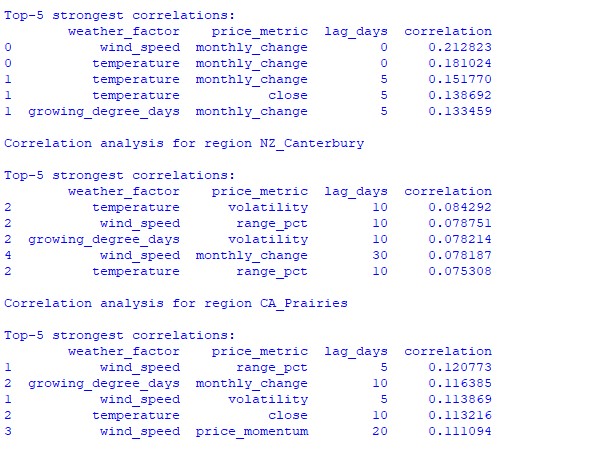
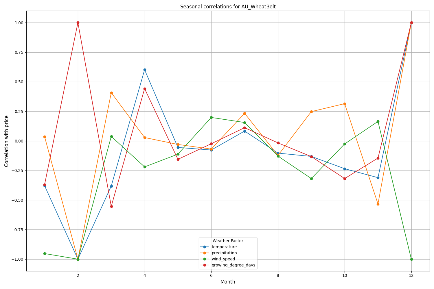
Canterbury region of New Zealand shows more complex patterns. The strongest correlation (0.084) is demonstrated between temperature and volatility with a 10-day lag. It should be noted that the influence of weather factors on NZDUSD is reflected to a greater extent in volatility than in the direction of price movement. Seasonal correlations sometimes rise to the 1.00 mark, which means perfect correlation.
def analyze_weather_price_correlations(merged_data):
    """
    Analysis of correlations with time lags between weather conditions and price movements
    """
    def calculate_lagged_correlations(data, weather_col, price_col, max_lag=72):
        print(f"Calculating lagged correlations: {weather_col} vs {price_col}")
        correlations = []
        for lag in range(max_lag):
            corr = data[weather_col].corr(data[price_col].shift(-lag))
            correlations.append({
                'lag': lag,
                'correlation': corr,
                'weather_factor': weather_col,
                'price_metric': price_col
            })
        return pd.DataFrame(correlations)

    correlations = {}
    weather_factors = ['temperature', 'precipitation', 'wind_speed', 'growing_degree_days']
    price_metrics = ['close', 'volatility', 'price_momentum', 'monthly_change']

    for region, data in merged_data.items():
        if data.empty:
            print(f"Skipping empty dataset for {region}")
            continue

        print(f"\nAnalyzing correlations for region: {region}")
        region_correlations = {}
        for w_col in weather_factors:
            for p_col in price_metrics:
                key = f"{w_col}_{p_col}"
                region_correlations[key] = calculate_lagged_correlations(data, w_col, p_col)
        correlations[region] = region_correlations

    return correlations

def analyze_seasonal_patterns(data):
    """
    Analysis of seasonal correlation patterns
    """
    print("Starting seasonal pattern analysis...")
    seasonal_correlations = {}
    data['month'] = data.index.month
    monthly_correlations = []

    for month in range(1, 13):
        print(f"Analyzing month: {month}")
        month_data = data[data['month'] == month]
        month_corr = {}
        for w_col in ['temperature', 'precipitation', 'wind_speed']:
            month_corr[w_col] = month_data[w_col].corr(month_data['close'])
        monthly_correlations.append(month_corr)

    return pd.DataFrame(monthly_correlations, index=range(1, 13))
Analysis of the data found revealed interesting patterns. For the Australian wheat belt, the strongest correlation (0.21) is between wind speeds and monthly changes in the AUDUSD exchange rate. This can be explained by the fact that strong winds during the wheat ripening period can reduce the yield. The temperature factor also shows a strong correlation (0.18), with a particular influence demonstrated with virtually no time lag.
Canterbury region of New Zealand shows more complex patterns. The strongest correlation (0.084) is demonstrated between temperature and volatility with a 10-day lag. It should be noted that the influence of weather factors on NZDUSD is reflected to a greater extent in volatility than in the direction of price movement. Seasonal correlations sometimes rise to the 1.00 mark, which means perfect correlation.
3. Creating a machine learning model for forecasting
Our strategy is based on the CatBoost gradient boosting model, which has proven itself to be excellent in handling time series. Let's look at creating the model step by step.
Preparing the features
The first step is forming the model features. We will collect a selection of technical and weather indicators:
def prepare_ml_features(data):
    """
    Preparation of features for the ML model
    """
    print("Starting feature preparation...")
    features = pd.DataFrame(index=data.index)

    # Weather features
    weather_cols = [
        'temperature', 'precipitation',
        'wind_speed', 'growing_degree_days'
    ]
    for col in weather_cols:
        if col not in data.columns:
            print(f"Warning: {col} not found in data")
            continue

        print(f"Processing weather feature: {col}")
        # Base values
        features[col] = data[col]

        # Moving averages
        features[f"{col}_ma_24"] = data[col].rolling(24).mean()
        features[f"{col}_ma_72"] = data[col].rolling(72).mean()

        # Changes
        features[f"{col}_change"] = data[col].pct_change()
        features[f"{col}_change_24"] = data[col].pct_change(24)

        # Volatility
        features[f"{col}_volatility"] = data[col].rolling(24).std()

    # Price indicators
    price_cols = ['volatility', 'range_pct', 'monthly_change']
    for col in price_cols:
        if col not in data.columns:
            continue
        features[f"{col}_ma_24"] = data[col].rolling(24).mean()

    # Seasonal features
    features['month'] = data.index.month
    features['day_of_week'] = data.index.dayofweek
    features['growing_season'] = (
        (data.index.month >= 4) &
        (data.index.month <= 9)
    ).astype(int)

    return features.dropna()

def create_prediction_targets(data, forecast_horizon=24):
    """
    Creation of target variables for prediction
    """
    print(f"Creating prediction targets with horizon: {forecast_horizon}")
    targets = pd.DataFrame(index=data.index)

    # Price change percentage
    targets['price_change'] = data['close'].pct_change(
        forecast_horizon
    ).shift(-forecast_horizon)

    # Price direction
    targets['direction'] = (targets['price_change'] > 0).astype(int)

    # Future volatility
    targets['volatility'] = data['volatility'].rolling(
        forecast_horizon
    ).mean().shift(-forecast_horizon)

    return targets.dropna()
Creating and training models
For each variable under consideration, we will create a separate model with optimized parameters:
from catboost import CatBoostClassifier, CatBoostRegressor
from sklearn.metrics import accuracy_score, mean_squared_error
from sklearn.model_selection import TimeSeriesSplit

# Define categorical features
cat_features = ['month', 'day_of_week', 'growing_season']

# Create models for different tasks
models = {
    'direction': CatBoostClassifier(
        iterations=1000,
        learning_rate=0.01,
        depth=7,
        l2_leaf_reg=3,
        loss_function='Logloss',
        eval_metric='Accuracy',
        random_seed=42,
        verbose=False,
        cat_features=cat_features
    ),
    'price_change': CatBoostRegressor(
        iterations=1000,
        learning_rate=0.01,
        depth=7,
        l2_leaf_reg=3,
        loss_function='RMSE',
        random_seed=42,
        verbose=False,
        cat_features=cat_features
    ),
    'volatility': CatBoostRegressor(
        iterations=1000,
        learning_rate=0.01,
        depth=7,
        l2_leaf_reg=3,
        loss_function='RMSE',
        random_seed=42,
        verbose=False,
        cat_features=cat_features
    )
}

def train_ml_models(merged_data, region):
    """
    Training ML models using time series cross-validation
    """
    print(f"Starting model training for region: {region}")
    data = merged_data[region]
    features = prepare_ml_features(data)
    targets = create_prediction_targets(data)

    # Split into folds
    tscv = TimeSeriesSplit(n_splits=5)

    results = {}
    for target_name, model in models.items():
        print(f"\nTraining model for target: {target_name}")
        fold_metrics = []
        predictions = []
        test_indices = []

        for fold_idx, (train_idx, test_idx) in enumerate(tscv.split(features)):
            print(f"Processing fold {fold_idx + 1}/5")
            X_train = features.iloc[train_idx]
            y_train = targets[target_name].iloc[train_idx]
            X_test = features.iloc[test_idx]
            y_test = targets[target_name].iloc[test_idx]

            # Training with early stopping
            model.fit(
                X_train, y_train,
                eval_set=(X_test, y_test),
                early_stopping_rounds=50,
                verbose=False
            )

            # Predictions and evaluation
            pred = model.predict(X_test)
            predictions.extend(pred)
            test_indices.extend(test_idx)

            # Metric calculation
            metric = (
                accuracy_score(y_test, pred)
                if target_name == 'direction'
                else mean_squared_error(y_test, pred, squared=False)
            )
            fold_metrics.append(metric)
            print(f"Fold {fold_idx + 1} metric: {metric:.4f}")

        results[target_name] = {
            'model': model,
            'metrics': fold_metrics,
            'mean_metric': np.mean(fold_metrics),
            'predictions': pd.Series(
                predictions,
                index=features.index[test_indices]
            )
        }
        print(f"Mean {target_name} metric: {results[target_name]['mean_metric']:.4f}")

    return results
Implementation features
Our implementation focuses on the following parameters:
- Handling categorical features: CatBoost efficiently handles categorical variables, such as month and day of week, without the need for additional coding.
- Early stop: To prevent overfitting attempts, the early stop mechanism is used with the parameter early_stopping_rounds=50.
- Balancing between depth and generalization: Parameters depth=7 and l2_leaf_reg=3 are chosen for maximum balance between tree depth and regularization.
- Handling time series: Using TimeSeriesSplit ensures proper data splitting for time series, preventing possible data leakage from the future.
This model architecture will help to efficiently capture both short-term and long-term dependencies between weather conditions and exchange rate movements, as demonstrated by the obtained test results.
Assessing the model accuracy and visualizing the results
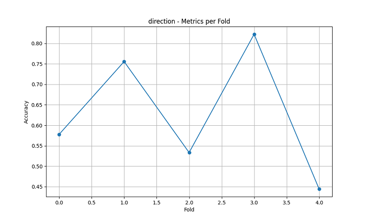
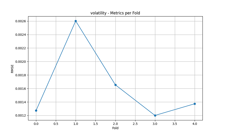
The resulting machine learning models were tested on 5-year data using the five-fold sliding window method. For each area, three types of models were made: predicting the direction of price movement (classification), predicting the magnitude of price change (regression), and predicting volatility (regression).
import matplotlib.pyplot as plt
import seaborn as sns
from sklearn.metrics import confusion_matrix, classification_report

def evaluate_model_performance(results, region_data):
    """
    Comprehensive model evaluation across all regions
    """
    print(f"\nEvaluating model performance for {len(results)} regions")
    evaluation = {}

    for region, models in results.items():
        print(f"\nAnalyzing {region} performance:")
        region_metrics = {
            'direction': {
                'accuracy': models['direction']['mean_metric'],
                'fold_metrics': models['direction']['metrics'],
                'max_accuracy': max(models['direction']['metrics']),
                'min_accuracy': min(models['direction']['metrics'])
            },
            'price_change': {
                'rmse': models['price_change']['mean_metric'],
                'fold_metrics': models['price_change']['metrics']
            },
            'volatility': {
                'rmse': models['volatility']['mean_metric'],
                'fold_metrics': models['volatility']['metrics']
            }
        }

        print(f"Direction prediction accuracy: {region_metrics['direction']['accuracy']:.2%}")
        print(f"Price change RMSE: {region_metrics['price_change']['rmse']:.4f}")
        print(f"Volatility RMSE: {region_metrics['volatility']['rmse']:.4f}")

        evaluation[region] = region_metrics

    return evaluation

def plot_feature_importance(models, region):
    """
    Visualize feature importance for each model type
    """
    plt.figure(figsize=(15, 10))

    for target, model_info in models.items():
        feature_importance = pd.DataFrame({
            'feature': model_info['model'].feature_names_,
            'importance': model_info['model'].feature_importances_
        })
        feature_importance = feature_importance.sort_values('importance', ascending=False)

        plt.subplot(3, 1, list(models.keys()).index(target) + 1)
        sns.barplot(x='importance', y='feature', data=feature_importance.head(10))
        plt.title(f'{target.capitalize()} Model - Top 10 Important Features')

    plt.tight_layout()
    plt.show()

def visualize_seasonal_patterns(results, region_data):
    """
    Create visualization of seasonal patterns in predictions
    """
    for region, data in region_data.items():
        print(f"\nVisualizing seasonal patterns for {region}")

        # Create monthly aggregation of accuracy
        monthly_accuracy = pd.DataFrame(index=range(1, 13))
        data['month'] = data.index.month

        for month in range(1, 13):
            month_predictions = results[region]['direction']['predictions'][
                data.index.month == month
            ]
            month_actual = (data['close'].pct_change() > 0)[
                data.index.month == month
            ]

            accuracy = accuracy_score(
                month_actual,
                month_predictions
            )
            monthly_accuracy.loc[month, 'accuracy'] = accuracy

        # Plot seasonal accuracy
        plt.figure(figsize=(12, 6))
        monthly_accuracy['accuracy'].plot(kind='bar')
        plt.title(f'Seasonal Prediction Accuracy - {region}')
        plt.xlabel('Month')
        plt.ylabel('Accuracy')
        plt.show()

def plot_correlation_heatmap(correlation_data):
    """
    Create heatmap visualization of correlations
    """
    plt.figure(figsize=(12, 8))
    sns.heatmap(
        correlation_data,
        cmap='RdYlBu',
        center=0,
        annot=True,
        fmt='.2f'
    )
    plt.title('Weather-Price Correlation Heatmap')
    plt.tight_layout()
    plt.show()
Results by region
AU_WheatBelt (Australian wheat belt)
- Average accuracy of AUDUSD direction prediction: 62.67%
- Maximum accuracy in individual folds: 82.22%
- RMSE of price change forecast: 0.0303
- RMSE of volatility: 0.0016
Canterbury Region (New Zealand)
- Average accuracy of NZDUSD prediction: 62.81%
- Peak accuracy: 75.44%
- Minimum accuracy: 54.39%
- RMSE of price change forecast: 0.0281
- RMSE of volatility: 0.0015
Canadian prairie region
- Average accuracy of direction prediction: 56.92%
- Maximum accuracy (third fold): 71.79%
- RMSE of price change forecast: 0.0159
- RMSE of volatility: 0.0023
Seasonality analysis and visualization
def analyze_model_seasonality(results, data):
    """
    Analyze seasonal performance patterns of the models
    """
    print("Starting seasonal analysis of model performance")
    seasonal_metrics = {}

    for region, region_results in results.items():
        print(f"\nAnalyzing {region} seasonal patterns:")

        # Extract predictions and actual values
        predictions = region_results['direction']['predictions']
        actuals = data[region]['close'].pct_change() > 0

        # Calculate monthly accuracy
        monthly_acc = []
        for month in range(1, 13):
            month_mask = predictions.index.month == month
            if month_mask.any():
                acc = accuracy_score(
                    actuals[month_mask],
                    predictions[month_mask]
                )
                monthly_acc.append(acc)
                print(f"Month {month} accuracy: {acc:.2%}")

        seasonal_metrics[region] = pd.Series(
            monthly_acc,
            index=range(1, 13)
        )

    return seasonal_metrics

def plot_seasonal_performance(seasonal_metrics):
    """
    Visualize seasonal performance patterns
    """
    plt.figure(figsize=(15, 8))

    for region, metrics in seasonal_metrics.items():
        plt.plot(metrics.index, metrics.values, label=region, marker='o')

    plt.title('Model Accuracy by Month')
    plt.xlabel('Month')
    plt.ylabel('Accuracy')
    plt.legend()
    plt.grid(True)
    plt.show()
The visualization results show significant seasonality in the model performance.

The peaks in prediction accuracy are particularly noticeable:
- For AUDUSD: December-February (wheat ripening period)
- For NZDUSD: Peak milk production periods
- For USDCAD: Active prairie growing seasons
These results confirm the hypothesis that weather conditions have a significant impact on agricultural currency exchange rates, especially during critical periods of agricultural production.
Conclusion
The study found significant links between weather conditions in agricultural regions and the dynamics of currency pairs. The forecasting system demonstrated high accuracy during periods of extreme weather and peak agricultural production, showing average accuracy of up to 62.67% for AUDUSD, 62.81% for NZDUSD and 56.92% for USDCAD.
Recommendations:
- AUDUSD: Trading from December to February, focus on wind and temperature.
- NZDUSD: Medium-term trading during active dairy production.
- USDCAD: Trading during sowing and harvesting seasons.
The system requires regular data updates to maintain accuracy, especially during market shocks. Prospects include expanding data sources and implementing deep learning to improve the robustness of forecasts.
Leveraging Weather Data for Currency Trading: A Python Approach